An organizational chart is a visual aid that helps individuals to understand the hierarchy of positions or things. If you’re someone looking for a quick way to create an organizational chart, then you’re reading the right article. No, we aren’t going to use the tool in Microsoft Word but instead, we are going to open a blank Google Spreadsheet.

With this Google feature, making an organizational hierarchy is rather simple, quick and easy. Just put the names into a column and voila!—the chart will be ready in a matter of few minutes. Follow the instructions below and create your very own organizational chart:
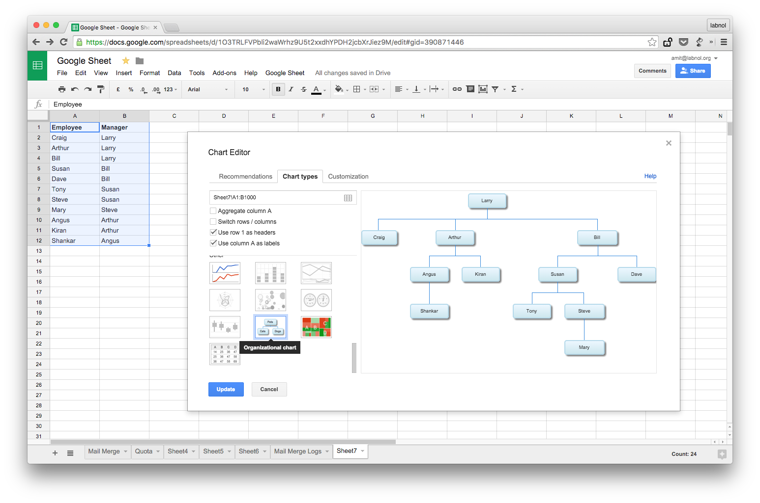
Directions
- Open a Google Sheet and begin to input names. For instance, you’re going to make an employee chart. Put the names of the employees under Column A and the names of the immediate or line managers in the next column.
- Select all the cells with info and then choose Chart from the Insert
- The Chart Editor with then open right inside Google Sheets. All you have to do then is to switch to the Chart Types tab and un-tick the Aggregate Column A option. Scroll down and scan on the list of all available chart types but choose Organizational Chart. Click Insert in order to add the chart to your spreadsheet.
Note:
- Don’t expect advanced tools in Google Sheets just like in Visio. However, you can change the background and fill colors of the different nodes within the chart. If you want to save the chart as a PNG image, just click on the drop-down arrow in the chartbox and you can download your own copy.